 |
CRM64Pro GDK v0.18.0
A free cross-platform game development kit built on top of SDL 3.0
|
|
CRM64Pro GDK v0.18.0
A free cross-platform game development kit built on top of SDL 3.0
|
Widget classes for building graphical user interfaces inside Panels [v26.05.0].
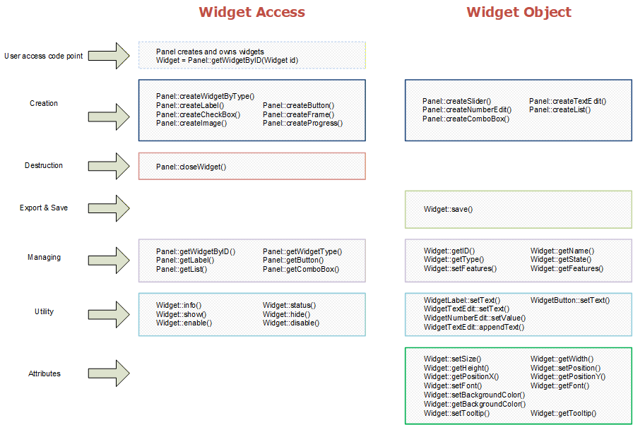
The Widget module provides all widget classes that can be used inside Panels. Widgets are the building blocks of the GUI system, ranging from simple display elements like labels and images to interactive controls like buttons, sliders, text editors and combo boxes. Each widget supports five visual states with independently configurable skins. Theme-driven styling is applied automatically and can be overridden per widget per state.
See GUI Manager for panel management, console, debug window and tooltip documentation.
TextEdit and Console editing preserve valid UTF-8 byte boundaries for insertion, deletion, cursor movement and selection. Widget text rendering still depends on the current bitmap Font module, which only renders the supported printable ASCII character set. Non-ASCII UTF-8 content can be stored and retrieved safely, but glyph rendering and visual cursor metrics for multi-byte characters are not yet supported.
Simple widgets
| Label | Static text display. Size auto-fits to text. Background disabled by default. |
|---|---|
| Image | Static image display. No text. Size taken from image asset when WF_BGFIT is not set. |
| Frame | Line or box widget for visual grouping. Renders filled (rectFilled) or outline (rect) based on setFilled(). Frame rendering uses the background RGB color as the line/fill/outline color; border width controls thin-line thickness, and border alpha can override outline alpha, but border RGB is not used by Frame rendering. Correctly handles thin (1D) sizing for horizontal and vertical dividers. |
| Button | Clickable button. Supports keyboard shortcut via setKey(). Fires setOnAction callback and EC_WIDGET_ACTION event on click or key activation. |
| CheckBox | Toggle control. Optional radio-button grouping via setGroup(). Group members can only be enabled, never self-disabled. Emits EC_WIDGET_TOGGLED when user interaction changes the checked value. |
| Progress | Value indicator rendered as discrete slices. Uses the standard numeric API: setValue(), getValue(), setRange(min,max) and getRange(&min,&max). Ranges may include negative values; the filled amount is measured from the configured minimum to the current value. Uses WS_PRESSED (filled) and WS_HOVERED (empty) skin states. See Progress Notes below. |
| Slider | Value slider with configurable horizontal or vertical axis. Uses the standard numeric API: setValue(), getValue(), setRange(min,max) and getRange(&min,&max). Ranges may include negative values. Thumb size can be fixed via setThumbSize(). Emits EC_WIDGET_VALUECHANGED for each distinct value reached during user interaction, including live dragging. |
Advanced widgets
| TextEdit | Single or multi-line text editor. UTF-8 cursor, selection (mouse drag and Shift-click), cut/copy/paste, 128-step undo/redo stack, mouse click-to-caret, keyboard navigation (Home/End/PgUp/PgDn/arrows), read-only mode. Fires EC_WIDGET_VALUECOMMITTED on Enter or focus exit when text changed, and EC_WIDGET_LOSTFOCUS on focus exit. CDC persistence stores only semantic editor configuration (multiline/read-only); runtime text content, caret, selection, scroll position, blink state and cached layout metrics are not saved. |
|---|---|
| NumberEdit | Inherits TextEdit. Numeric input with min/max/step validation, integer or float mode. Input is sanitized on each keystroke and committed on Enter or focus loss. Emits EC_WIDGET_VALUECOMMITTED when the committed value changes. Uses the standard numeric API: setValue(), getValue(), setRange(min,max) and getRange(&min,&max), alongside the base text API. CDC persistence stores the numeric value plus min/max/step/float-mode configuration, but not transient text-edit cursor, selection, or scroll state. |
| List | Scrollable item list. Single selection by default; multi-select (Ctrl+click toggle, Shift+click range from anchor) enabled via setMultiSelect(). Keyboard Up/Down moves by one item, Home/End moves to the first/last item, and PgUp/PgDn moves by one visible page while keeping the selection visible. Uses the standard selection API: setSelectedIndex(), getSelectedIndex(), setSelectedText() and getSelectedText(). setVisibleItems() resizes the list height to fit a requested row count. Emits EC_WIDGET_SELECTIONCHANGED when user interaction changes selection. Auto-sort mode available. getSelectedItems() returns all selected indices. CDC persistence stores widget configuration only; item contents and selection must be populated by the application at runtime. |
| ComboBox | Collapsed single-selection dropdown. Opens a popup list on click; ESC closes it. Uses the standard selection API: setSelectedIndex(), getSelectedIndex(), setSelectedText() and getSelectedText(). setVisibleItems() controls popup row capacity before scrolling. Emits EC_WIDGET_SELECTIONCHANGED when user interaction changes popup selection. Hover highlight during open. Popup is rendered in a second pass on top of all other panel widgets. Auto-sort mode available. When the first item is added, the current selection is initialized to item 1 automatically; applications may later clear the selection again with setSelectedIndex(0) or any negative value. Item contents and selection are runtime-owned and are not persisted in CDC widget blocks. |
Each widget transitions through 5 states driven by mouse and keyboard input. The base flow is:
WS_NORMAL → WS_HOVERED → WS_PRESSED → WS_ACTION → WS_NORMAL
ET_GUI_INTERNAL (the crafted focus-lost event) forces any non-deactivated widget back to WS_NORMAL immediately. Keyboard activation mirrors the mouse path through the auxiliary eAuxWS field without requiring mouse hover.
| WS_DEFAULT | Special selector used only by skin setter methods to target all states at once. Not a runtime state and never stored as eWS. |
|---|---|
| WS_NORMAL | Idle state. Mouse is not over the widget and no key is pressed. |
| WS_HOVERED | Mouse cursor is over the widget body. Fires the hover-enter callback on entry. |
| WS_PRESSED | Left mouse button is held down over the widget. Fires the pressed callback on entry. |
| WS_ACTION | Mouse button released over widget, or assigned key released. Command widgets emit EC_WIDGET_ACTION. Specialized widgets consume this state and emit semantic change events. |
| WS_DEACTIVATED | Widget is disabled. Does not handle events. Set via disable(); cleared via enable(). Drag and drop is reset on disable(). |
Each of the 5 states stores independent skin properties. When a widget-level setter is called, that property takes priority over the active theme for the selected state. When no widget-level override is present, the theme value is used. Theme entries themselves are defined on GUITheme objects and updated through the explicit GUITheme::setSkin...() methods. Background image and sprite assignments also suppress the primitive border color for that state.
| Background color | RGB solid fill. Cleared when an image or sprite is assigned to the same state. |
|---|---|
| Background image | Image ID for static image background. Setting WS_NORMAL automatically propagates to WS_HOVERED and WS_DEACTIVATED if those states have no existing background. Setting WS_PRESSED propagates to WS_ACTION if unset. |
| Background sprite | Sprite ID and animation index for animated background. When WS_DEFAULT is used, each successive state receives the next animation index. |
| Border | RGBA color, width in pixels and corner radius in pixels. Set iBorderColorA=0 or iBorderWidth=0 to disable the border. |
| Font | Font ID for text rendering. When not overridden, the font is resolved from the active theme: first by built-in name (FontMgr::getBuiltin), then by loaded font name, then falls back to CourierNew10White. |
Feature flags are set via setFeatures() and control optional widget behaviors.
| WF_FADE | Animated alpha show/hide transitions (WIDGET_FADING_TIME = 500 ms). Reversible mid-transition. |
|---|---|
| WF_DRAGDROP | Widget can be moved within its panel by mouse drag. Only one widget can be dragged at a time; drag is disabled on other widgets while this widget is being dragged. |
| WF_ENCLOSE | Prevents the widget body from leaving the parent panel bounds entirely. Applied by default to all widgets created through the Panel create* methods. Without this flag the widget is allowed to be mostly outside (minimum 4 pixels visible). |
| WF_DETACH | Uses the screen as the position/size reference instead of the parent panel. The widget can be positioned anywhere on the screen independently of the panel. |
| WF_BGFIT | Background image or sprite scales to the widget's current size rather than overriding the widget size when the asset is assigned. |
| WF_BGDISABLE | Suppresses background rendering entirely. Applied by default to Label and Frame widgets. |
| WF_EVENTS | Widget participates in the event routing protocol. Applied by default to Button, CheckBox, Slider, TextEdit, NumberEdit, List and ComboBox when created via Panel create* methods. Without this flag the widget may still render and update, but it reports WIDGET_UPDATE_FLAG_NOEVENT and is not treated as a normal event consumer by the parent panel. |
| WF_MOUSEOVER | Emits an EC_WIDGET_MOUSEHOVER event each frame while the widget is hovered, pressed or in action state. |
| WF_LOSTFOCUS | Emits an EC_WIDGET_LOSTFOCUS event on the transition from WS_HOVERED/WS_PRESSED/WS_ACTION to WS_NORMAL. TextEdit and NumberEdit use their keyboard-input focus lifecycle instead, so this event is emitted when text input focus is released. |
Widget update methods return exactly one base result ORed with zero or more flags. HIDDEN is terminal and must be tested first; it is never combined with flags.
| WIDGET_UPDATE_HIDDEN (-1) | Widget is not shown (GS_HIDDEN or GS_HIDING reached end). Terminal. |
|---|---|
| WIDGET_UPDATE_NOTHING (0) | Widget is visible and idle. |
| WIDGET_UPDATE_ACTIVITY (1) | Widget consumed user attention (hovered, pressed, or in action). Blocks drag and drop for lower-priority widgets and lower GUI layers. |
| WIDGET_UPDATE_CLOSEME (2) | Ephemeral panel TTL has elapsed and the panel requests removal by GUIMgr. |
Additional flags ORed into non-HIDDEN results:
| WIDGET_UPDATE_FLAG_NOEVENT (16) | Widget is visible but not an event consumer (WF_EVENTS not set). Drag and drop side-channel flags may still be set. |
|---|---|
| WIDGET_UPDATE_FLAG_DRAGDROP (32) | Widget is currently being drag-dropped. Disables drag for other widgets this frame. |
| WIDGET_UPDATE_FLAG_INPUTFOCUS (64) | Widget holds text/keyboard input focus. Routes SDL_EVENT_TEXT_INPUT to this GUI branch. |
| WIDGET_UPDATE_FLAG_LCLICK (128) | Widget received a left mouse button press. Parent GUI layers can use this as a focus or activation side-channel. |
| WIDGET_UPDATE_FLAG_CBGROUP (256) | A grouped CheckBox changed to the active state. Parent GUI code can use this side-channel to enforce single-selection behavior inside the group. |
Callbacks are set via std::function setters and are fired on widget state or semantic event edges. They are runtime-only and are not serialized when saving or loading a GUI definition. They complement the SDL queue event path: use callbacks for code-local reactions and the SDL queue for centralized event handling. Programmatic setters update widget state silently; when code needs user-event side effects, call the shared application logic explicitly after the setter.
| setOnAction(fn) | Fired by command-style widgets such as Button when WS_ACTION is reached. |
|---|---|
| setOnHoverEnter(fn) | Fired on the WS_NORMAL → WS_HOVERED transition edge. |
| setOnHoverExit(fn) | Fired when transitioning from WS_HOVERED, WS_PRESSED or WS_ACTION to WS_NORMAL. Represents pointer/hover exit. |
| setOnPressed(fn) | Fired on the WS_HOVERED → WS_PRESSED transition edge (mouse button down over widget). |
| setOnFocusLost(fn) | For normal widgets, fired on the same edge as the hover-exit callback. For TextEdit and NumberEdit, fired when keyboard-input focus is released after any pending value commit. Use the hover-exit callback for pointer-visual feedback. |
| setOnValueCommitted(fn) | Fired when TextEdit or NumberEdit accepts a changed value, matching EC_WIDGET_VALUECOMMITTED. |
| setOnSelectionChanged(fn) | Fired when user interaction changes List or ComboBox selection, matching EC_WIDGET_SELECTIONCHANGED. |
| setOnValueChanged(fn) | Fired when user interaction changes a live numeric widget value, matching EC_WIDGET_VALUECHANGED. |
| setOnToggled(fn) | Fired when user interaction changes CheckBox checked state, matching EC_WIDGET_TOGGLED. |
Widgets expose hover help through setTooltip(). The text is CDC-persisted in the typed widget CDC blocks, limited to WIDGET_TOOLTIP_MAXBYTES (63) bytes. The GUI manager renders the tooltip after GUI_TOOLTIP_DELAY_MS of stable hover, using the active theme's shared tooltip style unless the widget provides a local tooltip background/border/font override. Tooltip TTL is per-widget via setTooltipTTL(); the default is WIDGET_TOOLTIP_DEFAULT_TTL_MS = 0, which means the tooltip remains visible while the hover is valid (no auto-expiry). Set a positive value in milliseconds to have the tooltip hide automatically. After a tooltip expires, it will not show again for the same widget until the pointer leaves and re-hovers. Cursor-following can be enabled via setTooltipFollowCursor().
| Range | Progress uses an inclusive minimum/maximum range through setRange(min,max). Values are clamped to that range. Negative ranges are valid; for example setRange(-100,100) with value 0 renders half-filled. |
|---|---|
| Without image/sprite | Call setSize() before setRange(min,max) to ensure correct slice pixel calculations. |
| With image/sprite | Size is calculated automatically from the asset and the range span. WS_PRESSED skin is sampled for the asset dimensions. |
| State usage | WS_PRESSED renders filled slices (value reached). WS_HOVERED renders empty slices. WS_DEACTIVATED renders using WS_DEACTIVATED (filled) and WS_ACTION (empty). |
Widget CDC persistence uses one explicit fixed struct per widget family. All blocks start with the same WIDGET_IO_Block header and then continue with a typed base block plus an optional typed extension block. Tooltip text and tooltip settings live in the common base block. Widget-specific persistence no longer relies on shared offset macros or a packed reserved pool.
| Common base | WIDGETv1_Base_Block stores geometry, margins, alpha, key, stored label text, tooltip text/settings, tooltip override style, positions, and the 5 skin states. |
|---|---|
| Frame / CheckBox / Progress | Persist only meaningful widget state: frame filled flag, checkbox checked/group, progress value/min/max range/slice metrics. |
| Slider | Persists axis, value/min/max range and fixed thumb sizing. Derived thumb geometry is recomputed after load and is not stored. |
| TextEdit / NumberEdit | Persist only semantic editor configuration: TextEdit stores multiline/read-only, NumberEdit stores read-only plus numeric value/min/max/step/float-mode. Caret, selection, scroll and blink state are runtime-only. |
| List / ComboBox | Persist only configuration such as max visible items, autosort and multiselect. Runtime item contents, selection and popup/scroll state are not stored in CDC. |
Classes | |
| struct | CRM64Pro::GUITooltipStyle |
| Shared tooltip style for one GUI theme or one widget override. More... | |
| struct | CRM64Pro::GUIThemeSkin |
| Theme skin definition for one widget type and one widget state. More... | |
| class | CRM64Pro::GUITheme |
| GUI theme object. More... | |
| class | CRM64Pro::Widget |
| Base class for all GUI widgets. More... | |
| class | CRM64Pro::WidgetLabel |
| Label widget for static text display. More... | |
| class | CRM64Pro::WidgetImage |
| Image widget for static image display. More... | |
| class | CRM64Pro::WidgetFrame |
| Frame widget for separators, outlines and filled rectangles. More... | |
| class | CRM64Pro::WidgetButton |
| Button widget for user actions. More... | |
| class | CRM64Pro::WidgetCheckBox |
| CheckBox widget for toggle and radio-button behavior. More... | |
| class | CRM64Pro::WidgetProgress |
| Progress widget for value display. More... | |
| class | CRM64Pro::WidgetSlider |
| Slider widget for interactive value selection. More... | |
| class | CRM64Pro::WidgetTextEdit |
| TextEdit widget for editable text input. More... | |
| class | CRM64Pro::WidgetNumberEdit |
| NumberEdit widget for numeric text input. More... | |
| class | CRM64Pro::WidgetList |
| List widget with single-selection or interactive multi-selection support. More... | |
| class | CRM64Pro::WidgetComboBox |
| ComboBox widget for drop-down single selection. More... | |
Functions | |
| virtual bool | CRM64Pro::Widget::info (Sint32 iMode=0) |
| Request Widget object information. | |
| const string & | CRM64Pro::Widget::getName () const |
| Get the widget name. | |
| Sint32 | CRM64Pro::Widget::getID () const |
| Get the widget ID. | |
| eWidgetType | CRM64Pro::Widget::getType () const |
| Get the widget type. | |
| bool | CRM64Pro::Widget::disable () |
| Disable a widget. | |
| bool | CRM64Pro::Widget::enable () |
| Enable a widget. | |
| bool | CRM64Pro::Widget::show () |
| Show a widget. | |
| bool | CRM64Pro::Widget::hide () |
| Hide a widget. | |
| eGeneralStatus | CRM64Pro::Widget::status () const |
| Get the widget status. | |
| bool | CRM64Pro::Widget::setFeatures (eWidgetFeature eWF, bool bEnable) |
| Set widget feature flags. | |
| eWidgetFeature | CRM64Pro::Widget::getFeatures () const |
| Get widget feature flags. | |
| virtual Sint32 | CRM64Pro::Widget::setSize (Sint32 iWidth, Sint32 iHeight) |
| Set the size. | |
| Sint32 | CRM64Pro::Widget::getWidth () const |
| Get the widget width. | |
| Sint32 | CRM64Pro::Widget::getHeight () const |
| Get the widget height. | |
| Sint32 | CRM64Pro::Widget::setPosition (const Position &rPosX=Position(PH_CENTER), const Position &rPosY=Position(PH_CENTER)) |
| Set the position. | |
| const Position & | CRM64Pro::Widget::getPositionX () const |
| Get the widget X position. | |
| const Position & | CRM64Pro::Widget::getPositionY () const |
| Get the widget Y position. | |
| virtual bool | CRM64Pro::Widget::setMargin (Sint32 iTop, Sint32 iRight, Sint32 iBottom, Sint32 iLeft) |
| Set the margins. | |
| bool | CRM64Pro::Widget::getMargin (Sint32 *iTop, Sint32 *iRight, Sint32 *iBottom, Sint32 *iLeft) |
| Get the margins. | |
| bool | CRM64Pro::Widget::setAlphaMod (Uint8 iAlpha) |
| Set alpha modulation used for rendering this widget. | |
| Uint8 | CRM64Pro::Widget::getAlphaMod () const |
| Get alpha modulation used for rendering this widget. | |
| eWidgetState | CRM64Pro::Widget::getState () const |
| Get the widget state. | |
| virtual Sint32 | CRM64Pro::Widget::setFont (Sint32 idFont, eWidgetState eWS=WS_DEFAULT) |
| Set the font. | |
| Sint32 | CRM64Pro::Widget::getFont (eWidgetState eWS=WS_NORMAL) const |
| Get the font. | |
| Sint32 | CRM64Pro::Widget::setBorderWidth (Sint32 iWidth, eWidgetState eWS=WS_DEFAULT) |
| Set the border width. | |
| Sint32 | CRM64Pro::Widget::getBorderWidth (eWidgetState eWS=WS_NORMAL) const |
| Get the border width. | |
| Sint32 | CRM64Pro::Widget::setBorderCorner (Sint32 iRad, eWidgetState eWS=WS_DEFAULT) |
| Set the border corner radius. | |
| Sint32 | CRM64Pro::Widget::getBorderCorner (eWidgetState eWS=WS_NORMAL) const |
| Get the border corner radius. | |
| Sint32 | CRM64Pro::Widget::setBorderColor (Uint8 iR, Uint8 iG, Uint8 iB, Uint8 iA, eWidgetState eWS=WS_DEFAULT) |
| Set the border color. | |
| Sint32 | CRM64Pro::Widget::getBorderColor (Uint8 *iR, Uint8 *iG, Uint8 *iB, Uint8 *iA, eWidgetState eWS=WS_NORMAL) const |
| Get the effective border color. | |
| Sint32 | CRM64Pro::Widget::setBackgroundColor (Uint8 iR, Uint8 iG, Uint8 iB, eWidgetState eWS=WS_DEFAULT) |
| Set the background color. | |
| Sint32 | CRM64Pro::Widget::getBackgroundColor (Uint8 *iR, Uint8 *iG, Uint8 *iB, eWidgetState eWS=WS_NORMAL) const |
| Get the effective background color. | |
| Sint32 | CRM64Pro::Widget::setSelectionColor (Uint8 iR, Uint8 iG, Uint8 iB, Uint8 iA, eWidgetState eWS=WS_DEFAULT) |
| Set the selection highlight color. | |
| Sint32 | CRM64Pro::Widget::getSelectionColor (Uint8 *iR, Uint8 *iG, Uint8 *iB, Uint8 *iA, eWidgetState eWS=WS_NORMAL) const |
| Get the effective selection highlight color. | |
| Sint32 | CRM64Pro::Widget::resetSkin (eWidgetState eWS=WS_DEFAULT) |
| Clear custom skin overrides and custom background resources. | |
| Uint32 | CRM64Pro::Widget::getSkinOverrideMask (eWidgetState eWS=WS_NORMAL) const |
| Get the custom skin override mask for one state. | |
| Sint32 | CRM64Pro::Widget::clearBackground (eWidgetState eWS=WS_DEFAULT) |
| Clear custom background resources for one state. | |
| Sint32 | CRM64Pro::Widget::setBackgroundImage (const string &sCDCFile, const string &sName, eWidgetState eWS=WS_NORMAL) |
| Set the background image. | |
| Sint32 | CRM64Pro::Widget::setBackgroundImage (Sint32 idCDC, const string &sName, eWidgetState eWS=WS_NORMAL) |
| Set the background image. | |
| Sint32 | CRM64Pro::Widget::setBackgroundImage (Sint32 idImage, eWidgetState eWS=WS_NORMAL) |
| Set the background image. | |
| Sint32 | CRM64Pro::Widget::getBackgroundImage (eWidgetState eWS=WS_NORMAL) const |
| Get the background image. | |
| Sint32 | CRM64Pro::Widget::setBackgroundSprite (const string &sCDCFile, const string &sName, eWidgetState eWS=WS_DEFAULT, Sint32 iAnim=0) |
| Set the background sprite. | |
| Sint32 | CRM64Pro::Widget::setBackgroundSprite (Sint32 idCDC, const string &sName, eWidgetState eWS=WS_DEFAULT, Sint32 iAnim=0) |
| Set the background sprite. | |
| Sint32 | CRM64Pro::Widget::setBackgroundSprite (Sint32 idSprite, eWidgetState eWS=WS_DEFAULT, Sint32 iAnim=0) |
| Set the background sprite. | |
| Sint32 | CRM64Pro::Widget::getBackgroundSprite (eWidgetState eWS=WS_NORMAL, Sint32 *iAnim=nullptr) const |
| Get the background sprite. | |
| bool | CRM64Pro::Widget::setOnAction (function< void(Widget &)> fnCallback) |
| Set a callback fired when the widget triggers an action. | |
| bool | CRM64Pro::Widget::setOnHoverEnter (function< void(Widget &)> fnCallback) |
| Set a callback fired when the widget starts being hovered. | |
| bool | CRM64Pro::Widget::setOnHoverExit (function< void(Widget &)> fnCallback) |
| Set a callback fired when mouse hover exits the widget. | |
| bool | CRM64Pro::Widget::setOnPressed (function< void(Widget &)> fnCallback) |
| Set a callback fired when the widget is pressed. | |
| bool | CRM64Pro::Widget::setOnFocusLost (function< void(Widget &)> fnCallback) |
| Set a callback fired when the widget loses focus. | |
| bool | CRM64Pro::Widget::setOnValueCommitted (function< void(Widget &)> fnCallback) |
| Set a callback fired when an edit widget commits a changed value. | |
| bool | CRM64Pro::Widget::setOnSelectionChanged (function< void(Widget &)> fnCallback) |
| Set a callback fired when a selection widget changes selection. | |
| bool | CRM64Pro::Widget::setOnValueChanged (function< void(Widget &)> fnCallback) |
| Set a callback fired when a live value widget changes value. | |
| bool | CRM64Pro::Widget::setOnToggled (function< void(Widget &)> fnCallback) |
| Set a callback fired when a toggle widget changes state. | |
| Sint32 | CRM64Pro::Widget::setTooltip (const string &sText) |
| Set the tooltip text. | |
| const string & | CRM64Pro::Widget::getTooltip () const |
| Get the tooltip text. | |
| Sint32 | CRM64Pro::Widget::setTooltipTTL (Sint32 iMS) |
| Set the tooltip auto-hide time. | |
| Sint32 | CRM64Pro::Widget::getTooltipTTL () const |
| Get the tooltip auto-hide time. | |
| Sint32 | CRM64Pro::Widget::setTooltipFollowCursor (bool bEnable=true) |
| Set whether the tooltip follows the cursor. | |
| bool | CRM64Pro::Widget::isTooltipFollowingCursor () const |
| Check whether the tooltip follows the cursor. | |
| bool | CRM64Pro::Widget::setTooltipBackgroundColor (Uint8 iR, Uint8 iG, Uint8 iB, Uint8 iA) |
| Set the widget-local tooltip background color override. | |
| bool | CRM64Pro::Widget::getTooltipBackgroundColor (Uint8 *iR, Uint8 *iG, Uint8 *iB, Uint8 *iA) const |
| Get the effective tooltip background color. | |
| bool | CRM64Pro::Widget::setTooltipBorderColor (Uint8 iR, Uint8 iG, Uint8 iB, Uint8 iA) |
| Set the widget-local tooltip border color override. | |
| bool | CRM64Pro::Widget::getTooltipBorderColor (Uint8 *iR, Uint8 *iG, Uint8 *iB, Uint8 *iA) const |
| Get the effective tooltip border color. | |
| Sint32 | CRM64Pro::Widget::setTooltipFontName (const string &sFontName) |
| Set the widget-local tooltip font name override. | |
| Sint32 | CRM64Pro::Widget::setTooltipFont (Sint32 idFont) |
| Set the widget-local runtime tooltip font id override. | |
| Sint32 | CRM64Pro::Widget::getTooltipFont () const |
| Get the effective tooltip font id. | |
| Uint32 | CRM64Pro::Widget::getTooltipOverrideMask () const |
| Get the widget-local tooltip style override mask. | |
| Sint32 | CRM64Pro::Widget::resetTooltipStyle () |
| Reset widget-local tooltip style overrides. | |
| enum CRM64Pro::eWidgetState : Sint32 |
Widget state.
| enum CRM64Pro::eWidgetType : Sint32 |
Widget type. One value must be selected; values are not bitmask flags.
| enum CRM64Pro::eSliderAxis : Sint32 |
| enum CRM64Pro::eWidgetFeature : Uint32 |
Widget feature flags.
|
virtual |
Request Widget object information.
Writes information to the default log.
| iMode | 0 (default) for a stand-alone widget dump including the widget heading and indentation, or 1 when called from a parent object info() method to print only the nested widget body. |
Reimplemented in CRM64Pro::WidgetButton, CRM64Pro::WidgetCheckBox, CRM64Pro::WidgetComboBox, CRM64Pro::WidgetFrame, CRM64Pro::WidgetImage, CRM64Pro::WidgetLabel, CRM64Pro::WidgetList, CRM64Pro::WidgetNumberEdit, CRM64Pro::WidgetProgress, CRM64Pro::WidgetSlider, and CRM64Pro::WidgetTextEdit.
| const string & CRM64Pro::Widget::getName | ( | ) | const |
Get the widget name.
| Sint32 CRM64Pro::Widget::getID | ( | ) | const |
Get the widget ID.
| eWidgetType CRM64Pro::Widget::getType | ( | ) | const |
Get the widget type.
| bool CRM64Pro::Widget::disable | ( | ) |
Disable a widget.
Makes the widget non-interactive while keeping it renderable with its deactivated skin. Use hide() to remove it from rendering.
| bool CRM64Pro::Widget::enable | ( | ) |
Enable a widget.
Restores widget interaction and returns the widget state to ::WS_NORMAL.
| bool CRM64Pro::Widget::show | ( | ) |
Show a widget.
Makes the widget visible. This does not modify its enabled/disabled state.
| bool CRM64Pro::Widget::hide | ( | ) |
Hide a widget.
Makes the widget invisible. Hidden widgets are not updated or rendered.
| eGeneralStatus CRM64Pro::Widget::status | ( | ) | const |
Get the widget status.
| bool CRM64Pro::Widget::setFeatures | ( | eWidgetFeature | eWF, |
| bool | bEnable ) |
Set widget feature flags.
Check ::eWidgetFeature enum for a list of supported features.
| eWF | Widget features to enable or disable. |
| bEnable | true to enable the features, false to disable them. |
| eWidgetFeature CRM64Pro::Widget::getFeatures | ( | ) | const |
Get widget feature flags.
|
virtual |
Set the size.
| iWidth | widget width. Minimum width is 1. |
| iHeight | widget height. Minimum height is 1. |
Reimplemented in CRM64Pro::WidgetComboBox, CRM64Pro::WidgetList, CRM64Pro::WidgetProgress, CRM64Pro::WidgetSlider, and CRM64Pro::WidgetTextEdit.
| Sint32 CRM64Pro::Widget::getWidth | ( | ) | const |
Get the widget width.
| Sint32 CRM64Pro::Widget::getHeight | ( | ) | const |
Get the widget height.
| Sint32 CRM64Pro::Widget::setPosition | ( | const Position & | rPosX = Position(PH_CENTER), |
| const Position & | rPosY = Position(PH_CENTER) ) |
Set the position.
For "base" widgets, position is relative to the screen. For other widgets, position is relative to the "base" widget.
| rPosX | widget X position. Check ::ePositionHelper enum for position helpers. Default ::PH_CENTER. |
| rPosY | widget Y position. Check ::ePositionHelper enum for position helpers. Default ::PH_CENTER. |
| const Position & CRM64Pro::Widget::getPositionX | ( | ) | const |
Get the widget X position.
For "base" widgets, position is relative to the screen. For other widgets, position is relative to the "base" widget.
| const Position & CRM64Pro::Widget::getPositionY | ( | ) | const |
Get the widget Y position.
For "base" widgets, position is relative to the screen. For other widgets, position is relative to the "base" widget.
|
virtual |
Set the margins.
By default, the margins are set to 3.
| iTop | top margin in pixels. |
| iRight | right margin in pixels. |
| iBottom | bottom margin in pixels. |
| iLeft | left margin in pixels. |
Reimplemented in CRM64Pro::WidgetComboBox, CRM64Pro::WidgetList, CRM64Pro::WidgetProgress, CRM64Pro::WidgetSlider, and CRM64Pro::WidgetTextEdit.
| bool CRM64Pro::Widget::getMargin | ( | Sint32 * | iTop, |
| Sint32 * | iRight, | ||
| Sint32 * | iBottom, | ||
| Sint32 * | iLeft ) |
Get the margins.
| iTop | pointer filled with top margin in pixels. If nullptr, value not retrieved. |
| iRight | pointer filled with right margin in pixels. If nullptr, value not retrieved. |
| iBottom | pointer filled with bottom margin in pixels. If nullptr, value not retrieved. |
| iLeft | pointer filled with left margin in pixels. If nullptr, value not retrieved. |
| bool CRM64Pro::Widget::setAlphaMod | ( | Uint8 | iAlpha | ) |
Set alpha modulation used for rendering this widget.
| iAlpha | It ranges from 255 (opaque) to 0 (fully transparent). |
| Uint8 CRM64Pro::Widget::getAlphaMod | ( | ) | const |
Get alpha modulation used for rendering this widget.
| eWidgetState CRM64Pro::Widget::getState | ( | ) | const |
Get the widget state.
|
virtual |
Set the font.
| idFont | Font id. The widget stores a borrowed reference and will not close it. |
| eWS | Widget state. Check ::eWidgetState for further information. Default is WS_DEFAULT (affects all states). |
Reimplemented in CRM64Pro::WidgetComboBox, CRM64Pro::WidgetList, and CRM64Pro::WidgetTextEdit.
| Sint32 CRM64Pro::Widget::getFont | ( | eWidgetState | eWS = WS_NORMAL | ) | const |
Get the font.
| eWS | Widget state. Check ::eWidgetState for further information. Default is WS_NORMAL. |
| Sint32 CRM64Pro::Widget::setBorderWidth | ( | Sint32 | iWidth, |
| eWidgetState | eWS = WS_DEFAULT ) |
Set the border width.
| iWidth | border width in pixels. |
| eWS | Widget state. Check ::eWidgetState for further information. Default is WS_DEFAULT (affects all states). |
| Sint32 CRM64Pro::Widget::getBorderWidth | ( | eWidgetState | eWS = WS_NORMAL | ) | const |
Get the border width.
| eWS | Widget state. Check ::eWidgetState for further information. Default is WS_NORMAL. |
| Sint32 CRM64Pro::Widget::setBorderCorner | ( | Sint32 | iRad, |
| eWidgetState | eWS = WS_DEFAULT ) |
Set the border corner radius.
| iRad | border corner radius in pixels. |
| eWS | Widget state. Check ::eWidgetState for further information. Default is WS_DEFAULT (affects all states). |
| Sint32 CRM64Pro::Widget::getBorderCorner | ( | eWidgetState | eWS = WS_NORMAL | ) | const |
Get the border corner radius.
| eWS | Widget state. Check ::eWidgetState for further information. Default is WS_NORMAL. |
| Sint32 CRM64Pro::Widget::setBorderColor | ( | Uint8 | iR, |
| Uint8 | iG, | ||
| Uint8 | iB, | ||
| Uint8 | iA, | ||
| eWidgetState | eWS = WS_DEFAULT ) |
Set the border color.
| iR | The red color value. |
| iG | The green color value. |
| iB | The blue color value. |
| iA | The alpha value ranging from 0 (fully transparent) to 255 (opaque). |
| eWS | Widget state. Check ::eWidgetState for further information. Default is WS_DEFAULT (affects all states). |
| Sint32 CRM64Pro::Widget::getBorderColor | ( | Uint8 * | iR, |
| Uint8 * | iG, | ||
| Uint8 * | iB, | ||
| Uint8 * | iA, | ||
| eWidgetState | eWS = WS_NORMAL ) const |
Get the effective border color.
| iR | pointer filled with the Red component. If nullptr, value not retrieved. |
| iG | pointer filled with the Green component. If nullptr, value not retrieved. |
| iB | pointer filled with the Blue component. If nullptr, value not retrieved. |
| iA | pointer filled with the alpha component. If nullptr, value not retrieved. |
| eWS | Widget state. Check ::eWidgetState for further information. Default is WS_NORMAL. |
| Sint32 CRM64Pro::Widget::setBackgroundColor | ( | Uint8 | iR, |
| Uint8 | iG, | ||
| Uint8 | iB, | ||
| eWidgetState | eWS = WS_DEFAULT ) |
Set the background color.
| iR | The red color value. |
| iG | The green color value. |
| iB | The blue color value. |
| eWS | Widget state. Check ::eWidgetState for further information. Default is WS_DEFAULT (affects all states). |
| Sint32 CRM64Pro::Widget::getBackgroundColor | ( | Uint8 * | iR, |
| Uint8 * | iG, | ||
| Uint8 * | iB, | ||
| eWidgetState | eWS = WS_NORMAL ) const |
Get the effective background color.
| iR | pointer filled with the Red component. If nullptr, value not retrieved. |
| iG | pointer filled with the Green component. If nullptr, value not retrieved. |
| iB | pointer filled with the Blue component. If nullptr, value not retrieved. |
| eWS | Widget state. Check ::eWidgetState for further information. Default is WS_NORMAL. |
| Sint32 CRM64Pro::Widget::setSelectionColor | ( | Uint8 | iR, |
| Uint8 | iG, | ||
| Uint8 | iB, | ||
| Uint8 | iA, | ||
| eWidgetState | eWS = WS_DEFAULT ) |
Set the selection highlight color.
| iR | The red color value. |
| iG | The green color value. |
| iB | The blue color value. |
| iA | The alpha value ranging from 0 (fully transparent) to 255 (opaque). |
| eWS | Widget state. Check ::eWidgetState for further information. Default is WS_DEFAULT (affects all states). |
| Sint32 CRM64Pro::Widget::getSelectionColor | ( | Uint8 * | iR, |
| Uint8 * | iG, | ||
| Uint8 * | iB, | ||
| Uint8 * | iA, | ||
| eWidgetState | eWS = WS_NORMAL ) const |
Get the effective selection highlight color.
| iR | pointer filled with the Red component. If nullptr, value not retrieved. |
| iG | pointer filled with the Green component. If nullptr, value not retrieved. |
| iB | pointer filled with the Blue component. If nullptr, value not retrieved. |
| iA | pointer filled with the alpha component. If nullptr, value not retrieved. |
| eWS | Widget state. Check ::eWidgetState for further information. Default is WS_NORMAL. |
| Sint32 CRM64Pro::Widget::resetSkin | ( | eWidgetState | eWS = WS_DEFAULT | ) |
Clear custom skin overrides and custom background resources.
| eWS | Widget state. Check ::eWidgetState for further information. Default is WS_DEFAULT (affects all states). |
| Uint32 CRM64Pro::Widget::getSkinOverrideMask | ( | eWidgetState | eWS = WS_NORMAL | ) | const |
Get the custom skin override mask for one state.
| eWS | Widget state. Check ::eWidgetState for further information. Default is WS_NORMAL. |
| Sint32 CRM64Pro::Widget::clearBackground | ( | eWidgetState | eWS = WS_DEFAULT | ) |
Clear custom background resources for one state.
| eWS | Widget state. Check ::eWidgetState for further information. Default is WS_DEFAULT (affects all states). |
| Sint32 CRM64Pro::Widget::setBackgroundImage | ( | const string & | sCDCFile, |
| const string & | sName, | ||
| eWidgetState | eWS = WS_NORMAL ) |
Set the background image.
| sCDCFile | string containing the [directory]+filename. |
| sName | string with the image name (shorter than 64 characters). If already loaded, a new child is created. |
| eWS | Widget state (WS_DEFAULT not supported). With WS_NORMAL, if no other background is set on WS_HOVERED or WS_DEACTIVATED they use this one. With WS_PRESSED, if no other background is set on WS_ACTION it uses this one. Modified states also disable the border (alpha 0) and, without WF_BGFIT, the widget size matches the image size. |
| Sint32 CRM64Pro::Widget::setBackgroundImage | ( | Sint32 | idCDC, |
| const string & | sName, | ||
| eWidgetState | eWS = WS_NORMAL ) |
Set the background image.
| idCDC | CDC id. |
| sName | string with the image name (shorter than 64 characters). If already loaded, a new child is created. |
| eWS | Widget state (WS_DEFAULT not supported). With WS_NORMAL, if no other background is set on WS_HOVERED or WS_DEACTIVATED they use this one. With WS_PRESSED, if no other background is set on WS_ACTION it uses this one. Modified states also disable the border (alpha 0) and, without WF_BGFIT, the widget size matches the image size. |
| Sint32 CRM64Pro::Widget::setBackgroundImage | ( | Sint32 | idImage, |
| eWidgetState | eWS = WS_NORMAL ) |
Set the background image.
| idImage | Image id. The image ownership will be taken by this widget; the caller must not close it after a successful call. |
| eWS | Widget state (WS_DEFAULT not supported). With WS_NORMAL, if no other background is set on WS_HOVERED or WS_DEACTIVATED they use this one. With WS_PRESSED, if no other background is set on WS_ACTION it uses this one. Modified states also disable the border (alpha 0) and, without WF_BGFIT, the widget size matches the image size. |
| Sint32 CRM64Pro::Widget::getBackgroundImage | ( | eWidgetState | eWS = WS_NORMAL | ) | const |
Get the background image.
| eWS | Widget state. Check ::eWidgetState for further information. Default is WS_NORMAL. |
| Sint32 CRM64Pro::Widget::setBackgroundSprite | ( | const string & | sCDCFile, |
| const string & | sName, | ||
| eWidgetState | eWS = WS_DEFAULT, | ||
| Sint32 | iAnim = 0 ) |
Set the background sprite.
| sCDCFile | string containing the [directory]+filename. |
| sName | string with the sprite name (shorter than 64 characters). If already loaded, a new child is created. |
| eWS | Widget state. With WS_DEFAULT, assigns animations per state: iAnim for WS_NORMAL, iAnim+1 for WS_HOVERED, iAnim+2 for WS_PRESSED, iAnim+3 for WS_ACTION, iAnim+4 for WS_DEACTIVATED. Modified states also disable border (alpha 0) and without WF_BGFIT, widget size matches sprite size. |
| iAnim | starting animation index. At least one animation must exist. Default is 0. |
| Sint32 CRM64Pro::Widget::setBackgroundSprite | ( | Sint32 | idCDC, |
| const string & | sName, | ||
| eWidgetState | eWS = WS_DEFAULT, | ||
| Sint32 | iAnim = 0 ) |
Set the background sprite.
| idCDC | CDC id. |
| sName | string with the sprite name (shorter than 64 characters). If already loaded, a new child is created. |
| eWS | Widget state. With WS_DEFAULT, assigns animations per state: iAnim for WS_NORMAL, iAnim+1 for WS_HOVERED, iAnim+2 for WS_PRESSED, iAnim+3 for WS_ACTION, iAnim+4 for WS_DEACTIVATED. Modified states also disable border (alpha 0) and without WF_BGFIT, widget size matches sprite size. |
| iAnim | starting animation index. At least one animation must exist. Default is 0. |
| Sint32 CRM64Pro::Widget::setBackgroundSprite | ( | Sint32 | idSprite, |
| eWidgetState | eWS = WS_DEFAULT, | ||
| Sint32 | iAnim = 0 ) |
Set the background sprite.
| idSprite | Sprite id. The sprite ownership will be taken by this widget; the caller must not close it after a successful call. |
| eWS | Widget state. With WS_DEFAULT, assigns animations per state: iAnim for WS_NORMAL, iAnim+1 for WS_HOVERED, iAnim+2 for WS_PRESSED, iAnim+3 for WS_ACTION, iAnim+4 for WS_DEACTIVATED. Modified states also disable border (alpha 0) and without WF_BGFIT, widget size matches sprite size. |
| iAnim | starting animation index. At least one animation must exist. Default is 0. |
| Sint32 CRM64Pro::Widget::getBackgroundSprite | ( | eWidgetState | eWS = WS_NORMAL, |
| Sint32 * | iAnim = nullptr ) const |
Get the background sprite.
| eWS | Widget state. Check ::eWidgetState for further information. Default is WS_NORMAL. |
| iAnim | pointer to get the animation index, or nullptr to skip. Default is nullptr. |
| bool CRM64Pro::Widget::setOnAction | ( | function< void(Widget &)> | fnCallback | ) |
Set a callback fired when the widget triggers an action.
| fnCallback | Callback invoked once when the widget enters WS_ACTION. |
| bool CRM64Pro::Widget::setOnHoverEnter | ( | function< void(Widget &)> | fnCallback | ) |
Set a callback fired when the widget starts being hovered.
| fnCallback | Callback invoked once when the widget enters WS_HOVERED. |
| bool CRM64Pro::Widget::setOnHoverExit | ( | function< void(Widget &)> | fnCallback | ) |
Set a callback fired when mouse hover exits the widget.
| fnCallback | Callback invoked once when the mouse leaves the widget hover/pressed/action flow and the widget returns to ::WS_NORMAL. |
| bool CRM64Pro::Widget::setOnPressed | ( | function< void(Widget &)> | fnCallback | ) |
Set a callback fired when the widget is pressed.
| fnCallback | Callback invoked once when the widget enters WS_PRESSED. |
| bool CRM64Pro::Widget::setOnFocusLost | ( | function< void(Widget &)> | fnCallback | ) |
Set a callback fired when the widget loses focus.
| fnCallback | Callback invoked once on the same edge where EC_WIDGET_LOSTFOCUS is generated. |
| bool CRM64Pro::Widget::setOnValueCommitted | ( | function< void(Widget &)> | fnCallback | ) |
Set a callback fired when an edit widget commits a changed value.
| fnCallback | Callback invoked once on the same edge where EC_WIDGET_VALUECOMMITTED is generated. |
| bool CRM64Pro::Widget::setOnSelectionChanged | ( | function< void(Widget &)> | fnCallback | ) |
Set a callback fired when a selection widget changes selection.
| fnCallback | Callback invoked once on the same edge where EC_WIDGET_SELECTIONCHANGED is generated. |
| bool CRM64Pro::Widget::setOnValueChanged | ( | function< void(Widget &)> | fnCallback | ) |
Set a callback fired when a live value widget changes value.
| fnCallback | Callback invoked once on the same edge where EC_WIDGET_VALUECHANGED is generated. |
| bool CRM64Pro::Widget::setOnToggled | ( | function< void(Widget &)> | fnCallback | ) |
Set a callback fired when a toggle widget changes state.
| fnCallback | Callback invoked once on the same edge where EC_WIDGET_TOGGLED is generated. |
| Sint32 CRM64Pro::Widget::setTooltip | ( | const string & | sText | ) |
Set the tooltip text.
Assigns a tooltip that appears automatically after hovering the widget for a short time. Tooltip text is limited to 63 visible ASCII characters (64 bytes including the terminator) and longer input is truncated. The tooltip text is serialized with the widget and rendered by the GUI manager using the active theme shared tooltip style, unless the widget overrides that style locally. New widgets default to a tooltip TTL of 0, meaning the tooltip remains visible while it stays valid.
| sText | Tooltip text. An empty string disables the tooltip. |
| const string & CRM64Pro::Widget::getTooltip | ( | ) | const |
Get the tooltip text.
| Sint32 CRM64Pro::Widget::setTooltipTTL | ( | Sint32 | iMS | ) |
Set the tooltip auto-hide time.
| iMS | Auto-hide time in milliseconds. Use 0 to keep the tooltip visible while it remains valid. |
| Sint32 CRM64Pro::Widget::getTooltipTTL | ( | ) | const |
Get the tooltip auto-hide time.
| Sint32 CRM64Pro::Widget::setTooltipFollowCursor | ( | bool | bEnable = true | ) |
Set whether the tooltip follows the cursor.
| bEnable | true to keep updating the tooltip position while hovering the same widget; false to freeze the position when shown. |
| bool CRM64Pro::Widget::isTooltipFollowingCursor | ( | ) | const |
Check whether the tooltip follows the cursor.
| bool CRM64Pro::Widget::setTooltipBackgroundColor | ( | Uint8 | iR, |
| Uint8 | iG, | ||
| Uint8 | iB, | ||
| Uint8 | iA ) |
Set the widget-local tooltip background color override.
This override is not state-based. It applies to the widget tooltip as a whole.
| iR | Red component. |
| iG | Green component. |
| iB | Blue component. |
| iA | Alpha component. |
| bool CRM64Pro::Widget::getTooltipBackgroundColor | ( | Uint8 * | iR, |
| Uint8 * | iG, | ||
| Uint8 * | iB, | ||
| Uint8 * | iA ) const |
Get the effective tooltip background color.
| iR | pointer filled with the Red component. If nullptr, value not retrieved. |
| iG | pointer filled with the Green component. If nullptr, value not retrieved. |
| iB | pointer filled with the Blue component. If nullptr, value not retrieved. |
| iA | pointer filled with the alpha component. If nullptr, value not retrieved. |
| bool CRM64Pro::Widget::setTooltipBorderColor | ( | Uint8 | iR, |
| Uint8 | iG, | ||
| Uint8 | iB, | ||
| Uint8 | iA ) |
Set the widget-local tooltip border color override.
This override is not state-based. It applies to the widget tooltip as a whole.
| iR | Red component. |
| iG | Green component. |
| iB | Blue component. |
| iA | Alpha component. |
| bool CRM64Pro::Widget::getTooltipBorderColor | ( | Uint8 * | iR, |
| Uint8 * | iG, | ||
| Uint8 * | iB, | ||
| Uint8 * | iA ) const |
Get the effective tooltip border color.
| iR | pointer filled with the Red component. If nullptr, value not retrieved. |
| iG | pointer filled with the Green component. If nullptr, value not retrieved. |
| iB | pointer filled with the Blue component. If nullptr, value not retrieved. |
| iA | pointer filled with the alpha component. If nullptr, value not retrieved. |
| Sint32 CRM64Pro::Widget::setTooltipFontName | ( | const string & | sFontName | ) |
Set the widget-local tooltip font name override.
This override is not state-based. It applies to the widget tooltip as a whole.
| sFontName | Font name. Built-in fonts should use the full @c64/font/... name. |
| Sint32 CRM64Pro::Widget::setTooltipFont | ( | Sint32 | idFont | ) |
Set the widget-local runtime tooltip font id override.
This override is not state-based. It applies to the widget tooltip as a whole.
| idFont | Runtime font id. Set to -1 to clear the direct font id. The widget stores a borrowed reference and will not close it. |
| Sint32 CRM64Pro::Widget::getTooltipFont | ( | ) | const |
Get the effective tooltip font id.
| Uint32 CRM64Pro::Widget::getTooltipOverrideMask | ( | ) | const |
Get the widget-local tooltip style override mask.
Use this to know whether the effective tooltip style values come from widget-local overrides or the active theme.
| Sint32 CRM64Pro::Widget::resetTooltipStyle | ( | ) |
Reset widget-local tooltip style overrides.
Clears the widget-local tooltip font, background color and border color overrides so the tooltip style is resolved from the active theme again. This does not modify the tooltip text, TTL or follow-cursor setting.